Radar charts are a very popular visualisation tool. Recently, Anthropic released one which went viral and was used to visualise AI capability vs observed usage across occupational categories. It circulated widely, drew significant attention, and became a major topic of discussion in technology and economics circles. This chart looked authoritative, but it obscured as many dimensions as it revealed.
This is not a criticism of Anthropic’s analysis but rather an observation about the type of visualisation used. The chart appears in many presentations, reports, research publications, and even computer games. But its broad adoption often stems from its supposed visual appeal rather than its ability to convey information clearly.
This article makes a simple argument: radar charts are not well suited to the comparisons they are most often used for. Those problems aren’t aesthetic or visual. They stem from structural flaws. We will describe four of them using a simulated dataset. We constructed the dataset to highlight the disadvantages of radar charts, not to prove a point, but to show that these issues can occur in the real world. We will describe each limitation, show what’s going wrong, and explain how to present it with a more appropriate chart.
The goal is not to argue that radar charts should never be used. It is to make the disadvantages clear, so the decision to use one reflects a genuine understanding of them rather than familiarity with the format.
Problem 1: The Axis-Order Illusion
Let’s start with a simple question. In what order should the axes on the radar chart be displayed?
And we can immediately see that there are no good answers here. Unlike a bar chart, whose values can be ranked, a radar chart imposes no natural discipline on axis placement. You can arrange six metrics around the circle in many different ways. The person creating the chart decides the order of the axes, adding another layer of subjectivity to the data’s presentation.
That choice is not neutral. When the axis order changes, every polygon on the radar chart changes shape. In our example, a country that looks strong under one arrangement can look weaker under another. The entity that usually dominates the chart, the one with the largest polygon, is partly a product of where its strongest metric falls relative to adjacent axes, not purely a reflection of the underlying data.
This is worth highlighting. It means two analysts using the same dataset and visualisation style can produce radar charts that tell different stories. And neither of them will be making any errors. They can choose different axis orders, both of which are arbitrary.
The Anthropic capability-versus-usage chart carries the same vulnerability. The occupational categories are arranged in a specific sequence around the radar. If we reorder them, the sectors that appear most underserved will shift position. The visual argument about where AI adoption is lagging is partly due to an axis-placement decision the chart provides no basis for.
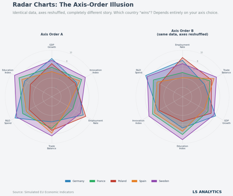
We can see this in our example above. The two charts use identical simulated data for five European countries across six economic indicators. Nothing has changed except the axis order.
But the chart shapes are different. On the first chart, Sweden looks very strong, and Germany is weaker. In the second chart, Germany looks stronger, in my opinion. And the charts should leave as few options as possible for different interpretations.
Problem 2: Area Distortion
While the axis-order problem is the most immediately apparent flaw in radar charts, area distortion is the most mathematically significant. This issue is pervasive and affects every radar chart produced.
The underlying mechanism is straightforward. In radar charts, the polygon’s size visually represents each item’s importance. A larger area suggests stronger performance, while a smaller area implies weaker performance. However, a radar chart’s area does not scale linearly with the underlying values; it scales with the square of those values.
This means that if one country scores twice as high as another on every metric, its polygon will not appear twice as large. It will appear four times as large.
A country scoring three times as high will produce a polygon with nine times the area. The visual gap between strong and weak performers is not only exaggerated but also grows more pronounced as the difference increases. This effect is evident in the chart below, where an entity scoring twice as high as another appears disproportionately superior.
The chart below quantifies such a comparison. A score of 9 is only three times a score of 3. But its radar polygon is nine times larger. The gap between the data and the visual relationship the chart presents is hard to correct mentally. And the goal of visualisations should be to present information as simply as possible. Here, radar charts don’t serve this goal.
Problem 3: Cognitive Overload
The first two problems we described were quite specific to radar charts. The next one can occur with other visualisation types as well, but radar charts magnify it significantly, making radar charts difficult to consume.
To be clear, radar charts are not inherently unreadable. With three or four categories, they are completely manageable. That may be one reason they are popular.
The problem begins when we add more categories. As we add more, the axes crowd together. With more categories, polygons start to overlap. It becomes common for one polygon to overlap the ones below it. And the problems come from both the number of variables and entities. The more we add, the less readable the radar charts get. This format quickly uses up visual space.
You can see this in the chart below. On the left side, we show 5 categories and 3 countries. The charts look manageable to read. To the right, the chart is way more complicated. With so many countries and categories, the chart is difficult to read and requires significant cognitive effort.
Problem 4: The Occlusion Trap
The last problem we will describe arises when radar charts are used to make head-to-head comparisons of similar objects.
When the object being compared scores differently across most metrics, the radar chart can be relatively visible and easy to read, and the shapes of each polygon are distinguishable. Problems arise when all visualised entities are close together, such as five similar countries or five products that score almost the same on all metrics. In such scenarios, radar charts fail us. Comparing similar objects in a radar chart is almost impossible.
We could try fixing this by adjusting the chart opacity with the alpha parameter, but that won’t save the radar chart in that setting. You can see this in the chart below.
On the left, the chart has high opacity values. We can see the polygon shapes clearly, but only a few are visible. The middle ones aren’t visible enough, they’re almost invisible. On the right, we lowered the chart opacity to preserve comparisons between countries better. However, each polygon is less visible now, and comparisons between them are still difficult. Either way, radar charts are basically useless for seeing subtle differences between similar objects.
The Fix
The four problems described above are structural and difficult to fix with radar charts alone. But they are also not inevitable. Choosing a different chart type can eliminate most, if not all, of them. The data and conclusions don’t change. Only the visual representation will.
Below, we will present two alternatives using the same dataset. We didn’t modify the data; we’re just using the same metrics to visualise them differently.
The grouped bar chart above is not a compromise. It improves in every dimension where the radar chart failed. Axis order is irrelevant as each metric occupies its own clearly labelled row, and rearranging those rows changes nothing about the comparisons within them.
Area distortion does not exist. Bar length linearly encodes value, the most perceptually accurate visual channel available. Complexity scales: adding more metrics adds rows, adding more countries adds bars per group, and the chart stays readable. Bar charts have limits here. This one is already quite data-heavy. And although it’s an improvement over the radar chart, adding more countries and metrics would make this chart harder to read.
Close comparisons are handled cleanly. When Germany and Sweden score similarly on R&D Spend, their bars sit adjacent and nearly the same length, and the small difference is immediately visible rather than buried in overlapping polygon fill.
The heatmap offers a different trade-off. It sacrifices the precise readability of bar lengths for a higher-density overview. Colour encodes the score, letting readers scan the entire matrix and spot patterns across countries and metrics at once. It is basically a table, but with colour encoding to make high and low values stand out more clearly. The diverging colour scale from red through the background grey to green maps naturally onto the underlying concept of low versus high performance.
Crucially, the heatmap also scales. If we added four more countries, four more rows would appear. Add three more metrics, and three more columns appear. The chart degrades gently and predictably, unlike the radar format, which becomes unusable well before it becomes complex.
Summary
Radar charts persist because they signal something. The symmetrical shape, the radiating axes, the overlapping polygons. They communicate that multiple dimensions were considered, that the analysis was thorough. This creates a powerful impression, and it is largely why the format appears so consistently.
But as we saw above, a radar chart doesn’t show more than a bar chart or a heatmap. It shows the same information, encoded in a harder-to-read format, distorted by geometry, and sensitive to too many arbitrary design decisions.
These are not reasons to categorically avoid radar charts. There are reasons to reach for one deliberately. With a clear account of why the format better serves the specific data than the alternatives, rather than because it looks like the kind of chart that takes things seriously.
Most of the time, however, a bar chart is a better option. It just looks less impressive.