A supermarket chain runs a loyalty program across 180 stores. The program has been live for almost two years, and many customers have joined.
The head of CRM wants to double the rewards budget. As support, it is claimed that loyalty program members spend over 400 EUR more per year than non-members. The program costs 30 EUR per user per year to run. Including the gross margin, the numbers show a profitable case after accounting for the loyalty scheme cost.
Measuring loyalty program effectiveness is harder than that. The 400 EUR may reflect what the program changed. It may also reflect who these customers already were. Before the chain spends more, it needs to separate the two.
That question is harder to answer than it sounds. Members were not randomly assigned. They chose to join the program, meaning there is a very strong case for self-selection bias.
This article goes deeper into loyalty program performance and how to measure this kind of marketing activity properly. Using simulated data, we aim to distinguish correlation from causation and show how to measure the effect of such activity. This is a crucial skill for businesses running loyalty programs, as it shows how to check whether spending drives a positive return on investment.
Who joins a loyalty program: the selection bias problem
The simplest way to measure a loyalty program’s effect is to compare members vs non-members. But every analysis of this kind carries a hidden assumption, stating that both groups of customers are the same.
But we can’t be sure in our case. A customer who joins a loyalty program is systematically different from the rest of the customer base. Program members tend to spend more and buy more frequently. They do this even before any loyalty program comes into play. We can often argue that a loyalty program doesn’t drive an uplift in customer activity; instead, it recruits the most active shoppers.
We can test this assumption by plotting spending trends for loyalty program members and the rest of the customers. What we see below supports this intuition.
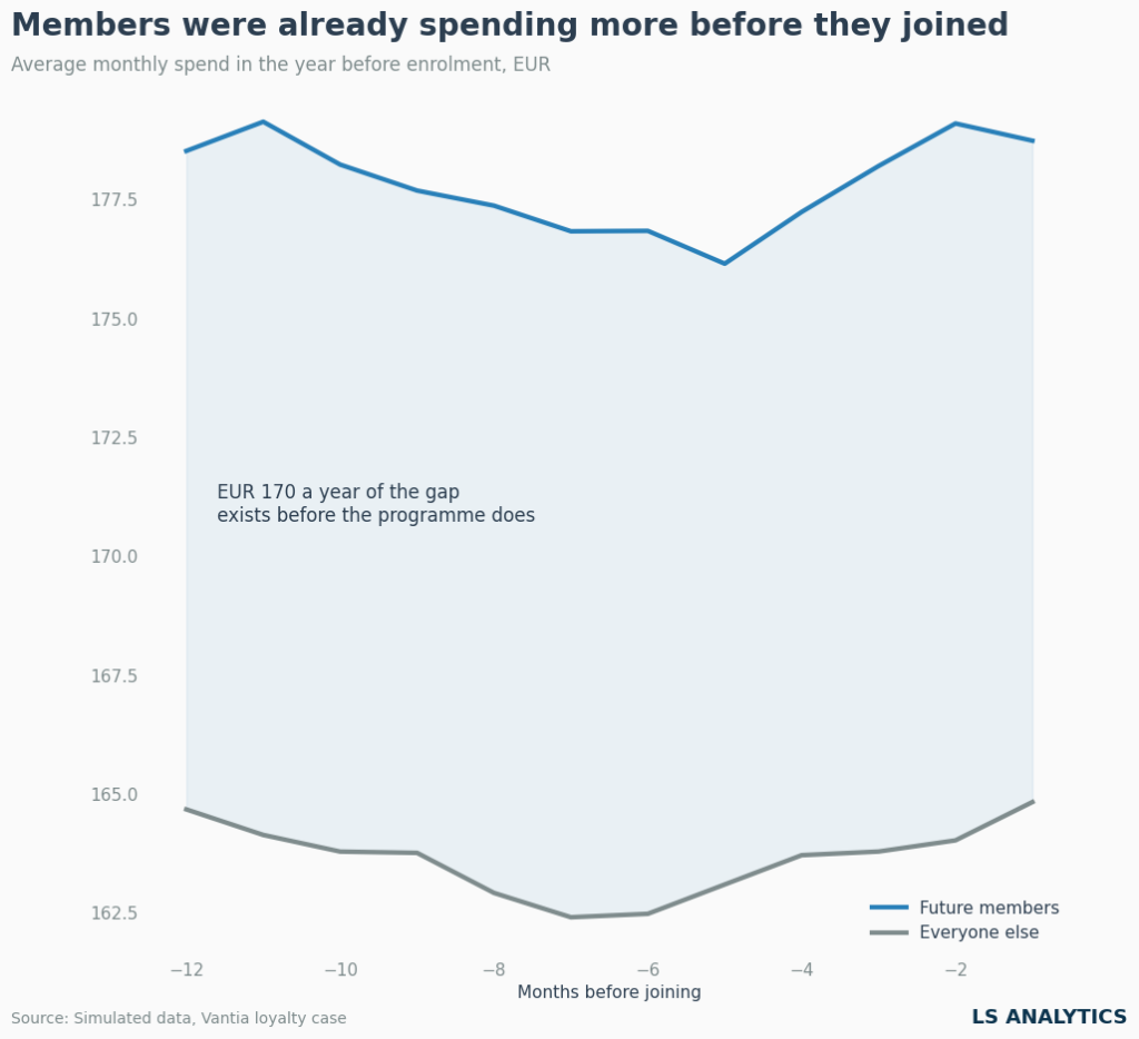
The chart above plots future loyalty program members and remaining customers, showing their activity in the months before they join the program. For remaining customers, we used a slightly more complex approach to provide a benchmark. We assign each a pseudo-enrolment month drawn at random from the distribution of real member sign-up dates. We treat a non-member assigned month 19 as though they joined then, with a pre-period running from month 7 to month 18. This lets us compare both groups on the same axis and quickly assess differences.
And what we observe is clear. Loyalty program members have consistently spent more than customers who opted out.
The mechanism is not mysterious. Loyalty programs recruit the people who already shop the chain frequently enough to find a card worth carrying. This clearly shows that higher-spending customers being loyalty program members doesn’t mean the program itself drove that effect. To measure the loyalty program’s effectiveness, we need causal methods to isolate the real incremental effect.
Before and after: why a members-only comparison misleads
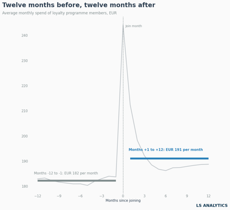
Comparing members to non-members failed because those groups were never similar. Another common way to measure the effect of such a program is to look at the difference in spending activity of loyalty program members before and after they joined. This is the analysis many teams reach to next, and its logic is very appealing. It’s intuitive and easy to compute. We can quantify the loyalty program’s results by comparing average spend in the 3 months before and the 3 months after each customer joined.
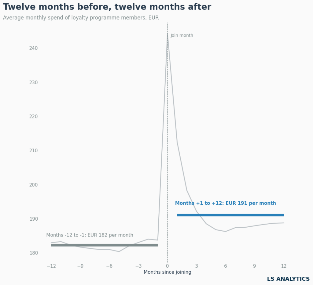
The effect is very visible this way. In the first 3 months after joining the program, customer spending increases drastically. Then, this trend abates, but overall, customers keep spending more even 12 months after joining. On average, loyalty program members spend 10 EUR more per month than before joining. Compounded over more months, this clearly shows a positive effect and a positive ROI.
However, pre/post analysis carries many risks and is not the gold standard for measuring loyalty program efficiency. One thing already visible on the chart is the huge spike in the month of joining the program. To avoid this spike from overwhelming the analysis, we calculate the post-average excluding this period.
Such a large spike might indicate a change in customer behaviour. For example, they might have made a large purchase and joined the program as a result. One example would be increased spending after having a child. We can’t exclude this effect using only pre/post analysis.
A before-and-after comparison assumes that nothing except the program changed between the two periods. That assumption is rarely safe. Many factors might correlate with the decision to join the loyalty program, such as life-changing events, seasonality, the overall economic situation, inflation, competitors’ activity, and more. We can’t rule out these effects without very strong assumptions.
For this reason, measuring loyalty program efficiency requires another approach. To do this, we need to apply causal inference methods to identify a reliable benchmark group for comparison.
Building a fair comparison group with matching
The previous section ended with a requirement to find a good benchmark, an equivalent of the control group from the randomised experiment. Our goal is to measure the loyalty program’s efficiency by finding a group of customers who didn’t join the program but are as similar as possible to the members. This way, we can compare the groups and measure the loyalty scheme’s effect fairly.
There are plenty of methods. This article won’t go into the technical details, but we will illustrate measurement using a technique called matching. The principle is very simple and intuitive. For each loyalty program member, we look through non-members for the one most similar to the member before they joined the scheme. After we pair them, we can compare those customers’ activity after the member joined the loyalty program. Since we assume the only difference between them is joining the loyalty scheme, the spending difference between the two groups should show the effect of joining the loyalty program on customer behaviour.
The crucial question is: what does “similar” mean?
The simplest approach is to use transactional history, since that is the data each e-commerce business has access to. The obvious answer is average spend over the year before enrolment. That’s too crude. A twelve-month average carries a lot of noise, and matching on it selects non-members who happened to have an unusually quiet or unusually heavy year.
We avoid this by splitting the pre-period in half and requiring a match on both. A customer can resemble a member by chance over one period. Resembling them across two separate ones is much harder to achieve by accident. We then add variables such as spending in the months before the join date, visit frequency, how many categories they buy across, and how long they have shopped with the chain. We then match within spend deciles, so a heavy spender is never matched against a light one, because we believe average spend is the main variable differentiating customers’ behaviour.
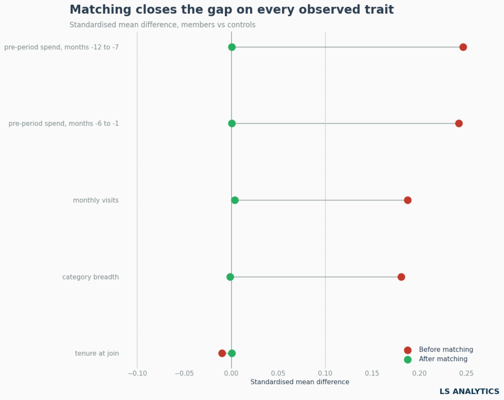
The chart checks whether the matching worked. Each row is one variable we matched on. The red dot shows how far apart members and non-members were before matching. The green dot shows the same comparison after each member is paired with their closest available counterpart.
The horizontal axis shows the standardised mean difference. It takes the gap between the two group averages and divides it by the data’s spread. Dividing by the spread is what makes the numbers comparable across different measurement scales. A value of zero means the two groups have the same average.
Before matching, the groups weren’t similar across all metrics. Those differences produced the inflated results when comparing members vs non-members. This chart clearly shows why the comparison inflated results: the two customer groups are fundamentally different.
After matching, the difference between the groups disappears, showing we found a comparable benchmark to measure the loyalty program’s effect. We retain around 95% of eligible members, so the comparison group isn’t built from a small, unrepresentative corner of the customer base.
Other causal inference approaches
Matching is one route among several, and the right choice depends on the data available and the problem we are trying to tackle. Other approaches worth knowing to measure the causal effect are as follows:
Propensity score matching reduces all customer traits to a single number, the probability of treatment, and matches on that.
Inverse probability weighting keeps every customer rather than discarding unmatched ones, reweighting them so the two groups look similar on average.
Synthetic control suits changes introduced at a more aggregate level, like shops, regions, or countries. It builds a weighted combination of untreated units that tracks the treated store before the change.
Staggered difference-in-differences estimators handle enrolment arriving across many months instead of a single date.
Each method mentioned above has one important limitation. Like with all causal infernece methods, they can account only for variables we measure. If something we never measured influences both the decision to join the loyalty scheme and spending levels, no amount of matching will remove it.
Members and matched controls over time
A balance chart shows that matching worked overall. Before jumping to conclusions, it is worth digging deeper and watching how the two groups actually move through time.
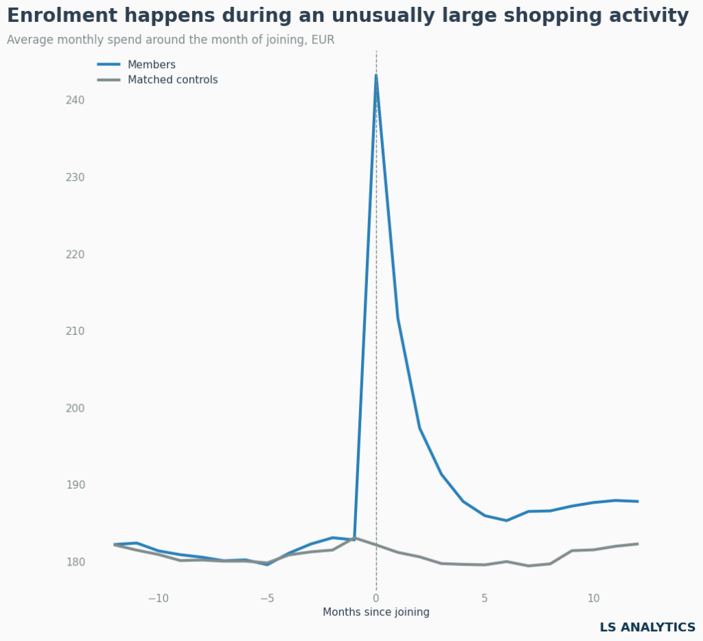
Before joining the loyalty program, spending behaviour between the two customer groups is similar and follows similar trends. This suggests the matching worked and the control group behaves as intended.
After a month of joining the loyalty program, we see a large gap, reflecting the initially high spend associated with joining. Then members’ spending decreases, but it remains higher than before the program, and the gap between the two groups stays substantial. This visually demonstrates the loyalty scheme’s positive effect on customer behaviour. If the program had no effect, both lines would have trended in the same direction.
It’s worth investigating why the gap between the two groups isn’t constant. It starts very broadly, then decreases and stabilises around 5 months after the customer joined the scheme. The initial strong reaction to the loyalty program isn’t caused solely by joining. We already discussed that it is partly because customers tend to join the program after a large shopping activity. They are even offered to join the program after spending a lot. Higher spending drives scheme membership, not the other way around. And even though we matched customers, no one in the control group has such high activity because we matched on activity in the months before they joined the program.
This difference doesn’t invalidate our matching analysis, but we applied transformations to capture the program’s true effect. If we used the period immediately after joining, the incremental effect would be inflated by higher initial spending that the program itself may not create. We want to measure the long-term effect.
For this reason, to calculate the program’s incremental results, we will consider only the difference between members and matched non-members 6 months after joining the program. This approach makes the effect more stable and conservative, and it reflects long-term changes in customer behaviour. Is it the only correct way? Obviously not, but with clearly stated assumptions and reasoning, it is definitely defensible. Excluding those months gives us an annualised estimate of a 73 EUR increase in customer spending after joining the loyalty program.
Adding difference-in-differences
73 EUR is closer to the real effect, but it still treats the whole remaining gap as if the program caused it. Two groups that looked identical last year can diverge this year for reasons unrelated to the loyalty scheme. A smaller issue also appears on the left of the chart above: the lines run close together but not exactly on top of each other, so matching leaves a residual difference.
Difference-in-differences removes that leftover gap. We take each group’s change from before to after enrolment, then subtract the control group’s change from the members’ change. The method assumes both groups would have kept moving in parallel without the program, and the matched pre-period trends support that. Applying it gives 68 EUR of annualised incremental revenue.
Loyalty program incrementality: five estimates compared
We have now measured the program’s effect in five different ways. Let’s put them together to decide which one to choose and show how each step of the analysis changed the answer.
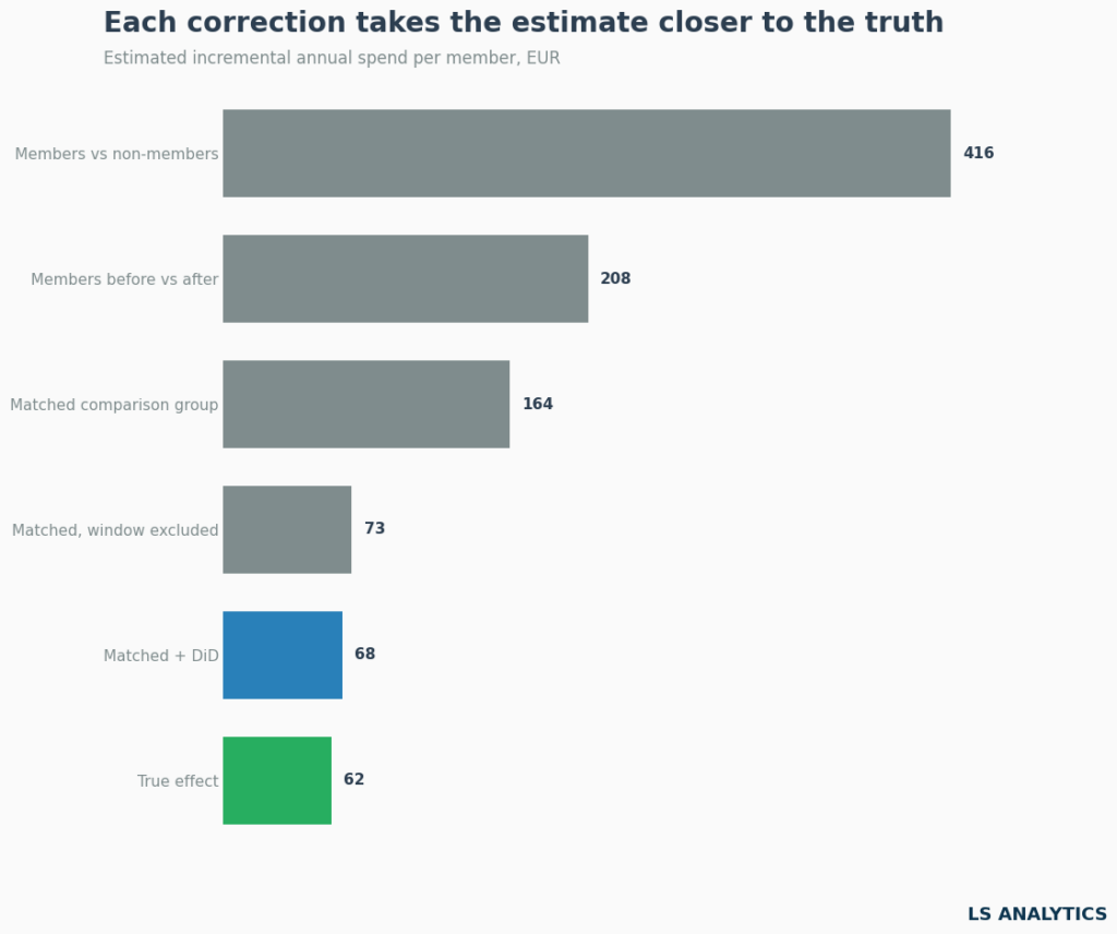
The first two bars show the simplest analysis we ran and the one we found most incorrect. Both are appealing, but too simplistic and share the same underlying problem: they lack a fair benchmark for comparison.
The next three bars come from the matched comparison group, and each removes one more source of bias. Matching addresses the fact that heavier shoppers are more likely to join. Excluding the months around sign-up removes the large shopping that triggers enrollment, which turns out to be the biggest single correction.
Subtracting the change in the control group accounts for other shifts during the year. That final step leaves 68 EUR per member per year, which we conclude is the loyalty program’s incremental effect on customers’ spending behaviour.
Because the data is simulated, we can check it against something a real analysis never has: the true answer. We built the program’s effect into the data at 62 EUR. Our estimate is slightly higher, mostly because of data noise. That is a good result for an observational method, and a fair reminder that causal inference techniques reduce bias rather than remove it completely. Nevertheless, it got us much closer to the truth than the initial approach.
What this does to the loyalty program ROI case
An incremental effect of 68 EUR in additional annual spend sounds appealing, but we must compare it with the program’s cost. After all, we could easily increase spend by offering more discounts, but it wouldn’t create a profitable business case. We want to increase customer spending, but only profitably.
Adding cost makes it more complex. First, we have to assume the margin the company takes from each sale. In our case, let’s assume it’s 28%, or about 19 EUR per member—and running the program costs, on average, 30 EUR per member. Based on those numbers, the loyalty program doesn’t increase the business’s profitability.
That average hides the more useful finding. The effect isn’t spread evenly across the member base, and splitting by spend changes the picture. Let’s split customers into spend deciles and show the gross margin on the incremental spend the program generates.
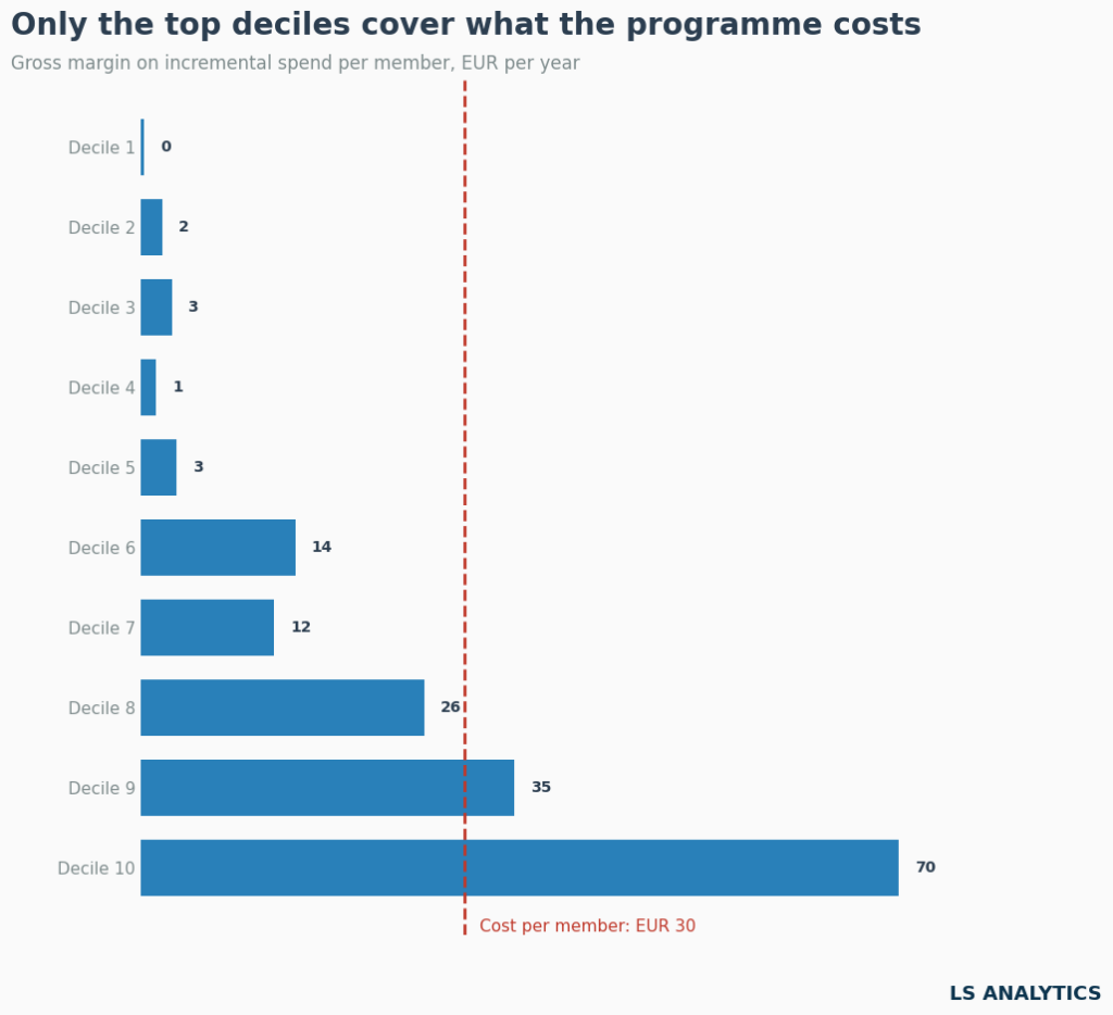
For the lower half of the member base, the program does almost nothing. These customers earn their rewards on shopping they would have done anyway, and the margin on any extra spending rounds to a few euros. The middle deciles do a little better but still aren’t profitable.
The top two deciles are different. Customers who spend the most respond to the program, and in the top decile, the margin on their extra spending is more than double the program cost. The loyalty scheme’s incremental return is concentrated among the most valuable customers. And this is good news, as the most valuable customers are responding positively to this incentive.
These findings should change our final recommendation. The original question was whether to double the reward budget. But doubling the reward budget across the entire database would only increase the loss. A better move is to modify it: keep rewards generous for customers who respond and reduce costs for the rest, for example, by offering less generous rewards to customers who spend less.
Measuring loyalty program effectiveness properly
The case in this article is simplified on purpose. To start with, we linked every transaction to a customer, whether a member or a non-member. Most retailers cannot do this, because shoppers without a card usually pay anonymously. We also assumed that nothing else the chain did during the year affected members differently than it did everyone else. These choices keep the story clean, and they’re why our estimate is so close to the true effect.
Real customers are messier. Matching can only balance what the data shows. If something unmeasured drives both the decision to join the loyalty program and spending levels, we can’t account for it in our analysis. A more reliable route is to build measurement into the next program change instead of reconstructing it afterwards.
The simplest way is a reward holdout. When the program launches, a random share of eligible members stays on the old rewards for a fixed period. Because the split is random, the two groups differ only in the treatment, and the comparison needs no matching or exclusion windows.
If holding back rewards from individual customers is commercially too costly, or you can’t identify non-members, you can move the test from customers to locations. In a geo test, the new tier launches in a set of stores or regions while comparable ones stay on the old scheme for a quarter or two. We measure the outcome using store-level sales, which every retailer already has.
Sometimes randomisation isn’t possible because the new tier has to launch in a flagship region or has already gone live in a few stores. Synthetic control handles this case. For each treated store, it builds a weighted combination of untreated stores whose combined sales tracked it closely before launch. After launch, that group acts as a counterfactual: what the store would have sold without the change. We can also use a tool like the CausalImpact library, which is designed to detect causal effects in time-series data.
Each option has a cost: a slower rollout, rewards withheld from part of the base, or a few months of waiting for results. Let’s set that against the decision this article started with. The team was ready to double the reward budget by far more than the program’s real effect justified, and a well-designed test would have caught that before they spent the money.