Evaluating the impact of treatments or interventions is critical in various fields, including business and healthcare. Determining whether a specific action produces the desired effect is essential for making informed decisions. While randomised experiments are considered the gold standard for such evaluations, they are not always feasible.
Various causal inference methods can be utilised to estimate treatment effects in these cases. Propensity score matching is one of the most used and most important methods. This method allows us to create comparable treatment and control groups based on observed characteristics.
This article describes the powerful method used in the causal inference workshop: propensity score matching, providing a guide to this analytical technique.
What is Propensity Score Matching?
Propensity score matching (PSM) lets us construct an artificial control group based on how similar treated and non-treated individuals are. When applying PSM, we match each treated unit with a non-treated unit of similar characteristics.
This way, we can obtain a control group without a randomised experiment. This artificial control group consists of non-treated units that resemble the treated group as closely as possible.
While PSM may seem straightforward, implementing it successfully is often complex. The key challenge lies in the method’s details, particularly finding suitable matches based on the available data and each unit’s pre-treatment characteristics.
Case Study: Evaluating a Job Training Program with the Lalonde Dataset
To explore propensity score matching, we will use the famous Lalonde dataset. The dataset comes from a study by Robert LaLonde (1986) that aimed to assess the effectiveness of a job training program on earnings. We will use the dataset used by Dehejia and Wahba in their paper “Causal Effects in Non-Experimental Studies: Reevaluating the Evaluation of Training Programs.”
The study evaluated the National Supported Work (NSW), a program designed to help disadvantaged workers, including ex-offenders, former drug addicts, and high school dropouts, find stable employment. The primary goal was to determine whether the program positively impacted participants’ earnings.
The data we will use does not come from the randomised experiment. The authors of the above-mentioned study combined data from randomly selected program participants with information on the untreated group from the Current Population Survey. They also augmented the dataset with pre-treatment variables, providing a clear example of evaluating the propensity score method.
Building a Causal Diagram for Treatment and Confounders
We will name all pre-treatment variables (age, pre-treatment earnings, etc.) X.
Our goal is to estimate the job training program’s effect on income. To conceptualise the analysed program, let’s briefly use more abstract, symbolic notation.
We will denote the treatment assigned to the selected group as T in our symbolic notation. This variable is crucial as it represents the core intervention of the job training program.
And we will use our outcome of interest – post-treatment earnings- as Y.
We can visualise the data set using causal diagrams. On the abstract level, our data is structured as follows: Pre-treatment variables influence treatment participation decisions and future earnings:
For example, let’s assume that people with higher education (X) are more likely to opt into the treatment than people without a degree. Generally, the higher the education level, the higher the earnings. Hence, people with a degree will most likely earn more after the treatment period, regardless of whether they participate in the program.
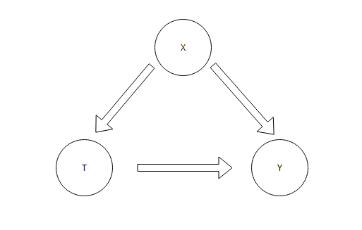
We call such a variable a confounder, as it affects both the treatment decision and the outcome. Unobserved confounders make calculating causal effects impossible.
One effective way to deal with confounders is to run a randomised experiment. This approach severs the link between X and T, as the treatment becomes independent of pre-treatment characteristics.
In our example, this would ensure that education levels are balanced across the treated and untreated groups, allowing a more accurate evaluation of the causal effect.
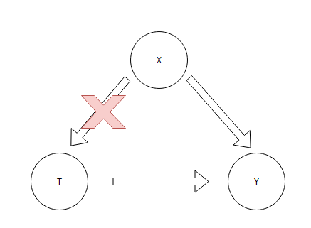
However, we don’t have the comfort of conducting a randomised experiment to solve the problem we’re analysing. The treatment and control groups differ in pre-treatment variables. For example (and we will explore this more soon), the treatment might have a larger proportion of older people. Therefore, we can’t compare earnings between the groups to estimate the treatment effect.
Enter propensity score matching. This method lets us create an artificial control group by matching the groups. Specifically, for each unit of the treatment group, we will assign the most similar unit from the control group. This technique helps balance pre-treatment characteristics in a non-randomised setting, leading to a more accurate estimate of the average treatment effect.
Exploring the Dataset
Enough of the theoretical background. Now it’s a great time to look at the data. We will explore the dataset and then apply propensity score matching to estimate the job program’s effect.
The dataset is relatively simple, making it ideal for exploring propensity score matching. It contains information about job training program participants and the control group, with variables describing each unit.

The dataset includes the following variables:
- Treat: Treatment status (1 if treated, 0 if not treated). This variable indicates whether an individual participated in the job training program.
- Age
- Edu – years of education
- Race
- Married: Marital status (1 if married, 0 otherwise).
- Nodegree: Indicator variable for educational level (1 if the individual does not have a high school degree, 0 otherwise).
- Re74: earnings in 1974
- Re75: earnings in 1975
- Re78: earnings in 1978
Comparing Treated and Control Groups Before Matching
Our primary goal is to estimate the treatment’s effect on the post-intervention earnings. However, we cannot compare the treated and non-treated groups directly because we lack a randomly selected control group. Nonetheless, we will use this comparison as a starting point for our analysis.
The initial findings are quite unexpected. Contrary to our expectations, the job training program has decreased average revenue. The difference between the two groups is nearly 500 EUR, with the untreated individuals seemingly benefiting more.
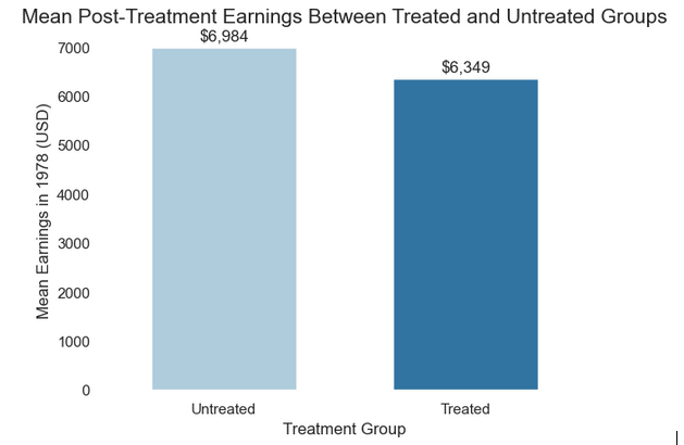
We can also compare the results by running a simple regression analysis with the treatment indicator as the only independent variable. It will also reveal the effect of the treatment—provided the critical assumptions are met.

The regression output quantifies the data from the chart above. Without controlling for any additional variables, the treatment has a negative effect. Can we trust those results and conclude that the job training negatively impacted future earnings?
Those results would be trustworthy only if both groups had the same observed and unobserved variable distribution. This situation is almost only possible with randomisation.
Checking Covariate Balance Between Groups
One way to check whether the groups in the experiments are comparable is to examine the distribution of pre-treatment variables. If they differ, the groups differ, and we need to dig deeper to explore any causal relationship.
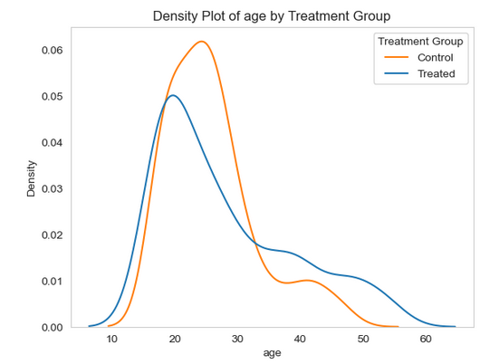
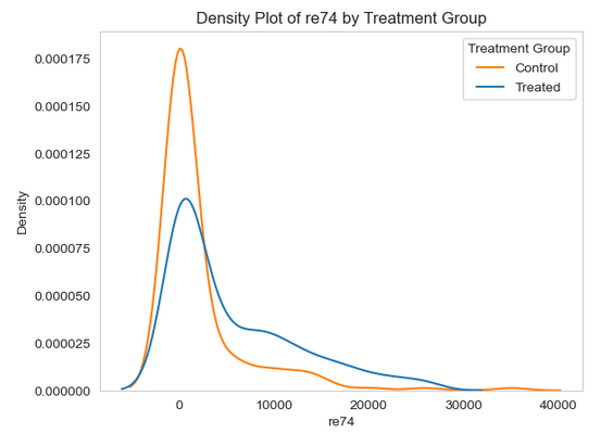
The section below shows density plots that graphically represent the distribution of the continuous variable by treatment group. All the pre-treatment variables show distributions across both groups, indicating potential differences.
Upon analysis, it becomes apparent that the average age of individuals in the control group is slightly higher than that of the treated group – 28 years old compared to 25 years old. However, the treated group does exhibit a longer tail of older individuals.
The years of education variable is similar across the treated and control groups. Both groups have very similar average years of education: 10 years. Nevertheless, the distribution of this variable still does not look very similar across groups.

We also have data on pre-treatment earnings from 1974 and 1975. In both years, individuals in the treatment groups earned, on average, less than the control group.

Our dataset also contains categorical variables, which are even more accessible to compare. We can compare their means in both control and treated groups. We can see that individuals assigned to the treated group are more likely to be unmarried and have a lower education level. The race composition of both groups is also different, which might affect other socio-economic variables.

Another standard way to check group similarity in experiments is to run a statistical test comparing means or proportions between groups. The null hypothesis in all our tests states that the means or proportions between the control and treated groups are equal. Therefore, a low p-value leads us to reject the null hypothesis and conclude that the groups differ.
For the numerical variables, we will conduct the t-test using the SciPy library:
from scipy.stats import ttest_ind

def perform_ttest(group1, group2):
    t_stat, p_val = ttest_ind(group1, group2, equal_var=False)
    return t_stat, p_val

pre_treatment_vars = ['age', 'educ', 're74', 're75']

treated = lalonde[lalonde['treat'] == 1]
control = lalonde[lalonde['treat'] == 0]

ttest_results = []
for var in pre_treatment_vars:
    t_stat, p_val = perform_ttest(treated[var], control[var])
    ttest_results.append({'Variable': var, 'T-Statistic': round(t_stat, 2), 'P-Value': f"{p_val:.3f}"})

ttest_results_df = pd.DataFrame(ttest_results)

ttest_results_df
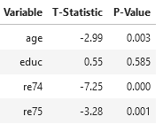
The results indicate insufficient evidence that units in the treated and control groups differ in years of education. Age and earnings before treatment differ significantly, which biases the simple comparison between groups.
Let’s follow a similar procedure for the categorical variables.
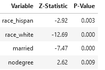
All categorical variables display significant differences between units assigned to the control and treatment groups. Thus, we can confidently conclude that they differ substantially.
Those disparities significantly affect our analysis. Based on the pre-treatment comparison, we can see that the groups differ substantially on the observable variables. Therefore, we can’t use simple comparisons to estimate the treatment effect. In causal inference, the groups are not exchangeable.
Exchangeability implies that the treated and control groups have the same distribution of confounders. If two groups are exchangeable, any differences in outcomes between them can be attributed to the treatment effect rather than to confounding variables.
In such a case, a control group can serve as a counterfactual for the treatment group. We assume the control group would have behaved the same as the treatment group had it not been treated. Likewise, the treatment group would exhibit the same values in the outcome variable as the control group had it not been treated. It is different in our example.
I will simplify a lot here, but the crucial part of the causal inference is finding the equivalent control group in cases like ours (unless we have data from a randomised experiment). We need a way to control for confounders and make both groups comparable.
Adjusting for Confounders with Linear Regression
The most straightforward, traditional way to adjust for differences in the distributions of confounding variables is to include them all as independent variables in the linear regression model.
In simplified terms, regression isolates each variable’s effect on the outcome at fixed levels of all other independent variables. We can expand the regression we ran before by adding all the remaining variables.
The coefficient on the treatment indicator shows the effect of job training on earnings, controlling for confounders.
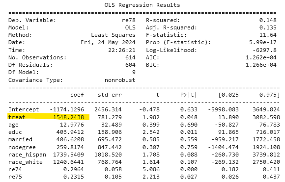
We can see that the effect differs substantially when comparing the two groups. After controlling for differences in observed variables, we see that the job treatment had positive results. It increased average earnings by over 1,500 USD.
While regression is a commendable method for adjusting for unbalanced confounders and accurately indicating the treatment’s direction, it does come with a caveat. It assumes a linear relationship between treatment and outcome. Expanding the linear model by experimenting with different functional forms of the independent variables is an option, but it complicates the model’s interpretation.
However, to overcome the linearity assumption and explore a causal effect more intuitively, we can turn to the hero of this article: propensity score matching. It offers a different approach that could address the limitations of the linear model.
How Propensity Score Matching Works
Propensity score matching is one of the most intuitive causal inference methods. It is also relatively straightforward to apply and can yield valuable, practical insights. The general idea is to estimate the probability of receiving the treatment based on measured variables. Estimating the likelihood of the treatment allows us to compute the propensity score for each unit.
Afterwards, we match units with the most similar propensity scores from the control group to units in the treatment group. This is the matching step. This creates an artificial control group with a distribution of the pre-treatment variable similar to the treatment group.
After matching, we can compare the outcome variable in the treatment groups with that in the matched control groups to estimate the treatment effect.
To summarise, we will apply the following steps:
- Estimating propensity scores
- Checking the balance of the propensity scores
- Matching the units based on the propensity score
- Calculating the effect of the treatment using the matched units
Let’s get it done!
Estimating Propensity Scores with Logistic Regression
To estimate the propensity score, we calculate the probability of being treated for each unit, given the set of pre-treatment variables. This step is usually done by applying a machine learning algorithm with binary treatment indicators as a dependent variable. Any classification algorithm will do the job; however, in causal inference, the simpler, the better.
Estimating the propensity score lets us control for imbalance in pre-treatment variables between the treatment and control groups. Since the groups are imbalanced, controlling for confounders helps us overcome this imbalance by estimating the probability of being assigned to the treatment group, given the data we have at hand.
In other words, propensity scores allow us to make the distributions of pre-treatment variables comparable, similar to what we would see in a randomised experiment. It sounds compelling—using observational data, we will have results similar to those from A/B testing.
We will see that the standard logistic regression is more than enough to calculate propensity scores. We could expand this method by applying more complex tree-based algorithms like random forest or gradient boosting. However, this would require combating overfitting. In causal inference, model accuracy or predictive power is not the main goal. Given all the critical variables, we just have to find the probability of treatment.
Applying the logistic regression in the case of PSM is easy. We can use the LogisticRegression() class from the sklearn library and apply the model to our data. Since we are not very interested in the predictive accuracy of this step and logistic regression is a relatively simple model, there is no need to conduct any split into training and test sets.
pre_treatment_vars = ['age', 'educ', 'married', 'nodegree', 'race_hispan', 'race_white', 're74', 're75']

X = lalonde[pre_treatment_vars]
y = lalonde['treat']


log_reg = LogisticRegression()
log_reg.fit(X, y)
lalonde['propensity_score_logistic'] = log_reg.predict_proba(X)[:, 1]

lalonde.head()
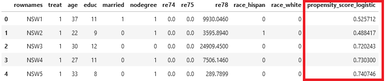
The last column in the data frame contains the propensity score. How can we interpret this number? Given our covariates, it shows the probability that a given individual would receive a treatment. For example, for the first unit in the table, the likelihood of receiving treatment given the covariates is 0.53, even though this person received treatment.
What Is Common Support in Propensity Score Matching?
After obtaining the propensity scores, we must check how well they are distributed across the treatment and control groups. The propensity score distributions must substantially overlap—some units in the control group must have a relatively high probability of receiving the treatment. Only then can we proceed to the matching step. Such an overlap is called common support.
The range of propensity scores between the two groups must overlap. We need this to obtain similar units across the treatment and control groups. Comparison is only possible with overlap, as there must be enough information to estimate the causal effect.
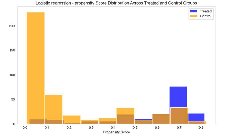
Plotting histograms of propensity scores by original group assignment is the best visual aid for checking standard support.
The chart below shows that individuals in the control group generally have a lower probability of being treated, and vice versa; individuals in the treated groups generally have a higher likelihood of being treated. This is expected, showing that logistic regression is relatively well calibrated.
The chart’s most important feature is the overlapping bars. A substantial portion of units have a relatively high probability of being treated despite being assigned to the control group. The same goes the other way: there are units in the treated groups that are less likely to be treated. This lets us find similar individuals in both groups, which is crucial for estimating the treatment effect.
A few paragraphs before, I mentioned that logistic regression will be our go-to algorithm. Now is a good time to explain this choice; fancier algorithms are often preferable in the machine learning world. We can calculate the propensity scores using the random forest to showcase this.
As with logistic regression, the following chart shows the propensity scores generated by the random forest algorithm.

This chart shows how the flawed propensity score balance looks. As with logistic regression, we can see that the probability of being treated is highly correlated with the actual treatment assigned. However, contrary to the previous approach, the overall overlap is minimal. Calculating the treatment effect based on such a distribution of propensity scores is not feasible.
Random forest overfits the data. We could overcome this problem by conducting cross-validation or restricting the model. Nevertheless, this is unnecessary, as the logistic regression worked well for our case. This suggests that a simple algorithm is often enough to estimate the probability of treatment. From this point onwards, we will use the scores generated by the logistic regression.
Matching Units by Propensity Score
We have completed the ‘propensity score’ part of the PSM approach. Now we move to the ‘matching’ step to construct a new, better control group.
We saw previously that the original treatment and control groups were unbalanced. Almost all pre-treatment variables were different between them. The matching step matches units based on the previously generated propensity scores to create a balanced distribution of pre-treatment variables.
Because the propensity score indicates the probability of treatment, individuals with similar propensity scores are likely to have similar characteristics. When we compare a treated individual with a similar individual originally in the control group, the difference between them can be attributed only to the treatment. The disparity in the outcome variable between such units will indicate the treatment effect.
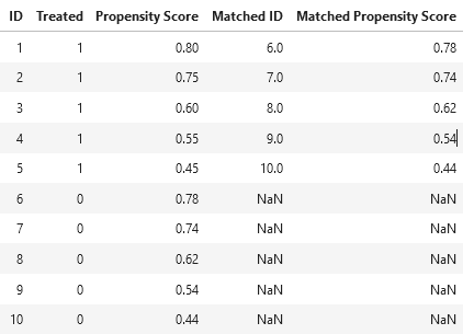
To understand this step, consider the following dummy table. It contains ten units, five assigned to the treatment group and 5 to the control group (Treated column). The data do not come from the randomised experiment, so each unit has a propensity score assigned. We can assume that it was calculated based on pre-treatment variables.
Unit ID 1 was in the treated group and had a high propensity score of 0.8. The goal of the matching step is to find an individual from the control group as similar as possible. We need to find the unit in the control group with a propensity score closest to 0.8. It would be unit 6, with a propensity score of 0.78.
Next, we move to unit ID 2. Unit 7 from the control group is the most similar, with a propensity score of 0.74. The process continues until we run out of the control group. Then, the matched units from the control group will work as the modified control group.
The modified control group will be significantly more similar to the treatment group than the original, non-random group. This improved similarity increases the accuracy of estimating differences in outcome variables, better reflecting the treatment’s effect. The matching process balances both groups well and offers promising potential for more robust research outcomes.
Average Treatment Effect on the Treated (ATT) vs Average Treatment Effect (ATE)
What would happen with control group units that are not matched with a treated group? Nothing; we will disregard them from the rest of the analysis, as they are not similar to anyone in the treated group. This version of propensity score matching trims the control group to units similar to those in the treatment group. This is one drawback of propensity score matching, as it results in a smaller (but more accurate) dataset.
Finding matches this way leads to a discussion of different treatment effects in causal inference. This kind of propensity score matching lets us calculate the average treatment effect on the treated (ATT), rather than the average treatment effect (ATE).
I will not delve into a theoretical discussion about different treatment effects here. For this post, we only have to intuitively cover the difference between ATT and ATE. Let’s start with the latter. The average treatment effect refers to the entire population of interest; it measures the impact of the treatment in both the treatment and control groups. We can think of it as the treatment effect if everyone in a given population received the treatment. For example, if the job training was available to the entire population of a given region.
What is the difference in the effect on the treated, then? It measures the impact of the treatment, but only for individuals who received it. We do this by matching similar units from the control group to the treated group. We might ask whether this treatment effect is inferior to the average treatment effect.
I can use the favorite reply in the social science universe—it depends. If we want to estimate the effect of the treatment on the entire population, we can’t use the method described here. Before you close this article with the feeling of wasted time, please hang on for a moment. Calculating the average treatment effect is exactly what we need to obtain here!
Usually, job training programs are not rolled out to the entire population. Only a subset of people who need them receive such a program. This group differs from the general population, as we have seen before. We are interested in understanding the impact of the treatment of those who received it. Understanding the effect on the entire population won’t be of significant interest, as such programs are specific. We are on the right track.
To summarise, propensity score matching involves matching treated units with control units to estimate the treatment effect only for the treated group. We will calculate how the job training program affected those participating. This will be highly practical, as it will help policymakers evaluate and optimise the program.
Matching with the Nearest Neighbours Algorithm
Let’s get back to the technical part. To find suitable matches, we can use unsupervised learning. Combining different machine learning methods is a very cool part of this approach. One of the best ways to conduct this step is to use the classic nearest neighbours algorithm.
To conduct the matching step, we will create two data frames, one exclusively for units from the treatment group and another for the control group. Then, we can run the NN algorithm, setting the n parameter to 1 to find the closest match for each unit in the treatment group.
The ‘n’ parameter in the NN algorithm represents the number of nearest neighbours to consider. By setting it to 1, we ensure that each unit in the treatment group is matched with its closest counterpart in the control group.
Then, we apply the model to the control group. This step was counterintuitive for me, but we had to teach the model of the structure of the propensity scores in the control group.
Afterwards, we apply the k-nearest neighbours method of the fitted model to the treatment groups. This step lets us find units in the control group that most closely match the treatment group. We store the results in two variables:
- Distances – indicating distance (or similarity) to the nearest neighbour
- Indices – location (data frame index) of the most similar unit in the control group
Subsequently, we create the new_control data frame based on the indices above. Our new control group contains only units selected as the most similar to the treatment groups based on the propensity score. The only step left is to join the original treatment group data with the newly matched control group. This will be the final dataset used to evaluate the treatment effect.
from sklearn.neighbors import NearestNeighbors

treated = lalonde[lalonde['treat'] == 1]
control = lalonde[lalonde['treat'] == 0]

nn = NearestNeighbors(n_neighbors=1)

nn.fit(control[['propensity_score_logistic']])

distances, indices = nn.kneighbors(treated[['propensity_score_logistic']])

matched_control_indices = indices.flatten()
new_control = control.iloc[matched_control_indices]

matched_data = pd.concat([treated, new_control])
After matching, we are almost ready to evaluate the treatment’s effect. However, before doing so, we must check whether the matched data produced a balanced dataset.
Checking Balance After Matching with Standardised Mean Difference
The goal of propensity score matching is to balance confounders between the treatment and control groups. There are many ways to check this. In the previous paragraph, we did this by comparing the distribution of each variable between both groups. This step requires extensive data visualisation and checking each variable separately.
A simpler, faster way to compare balance across variables is commonly used in matching methods. For continuous variables, we can apply a simple metric called standardised mean difference:
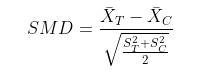
The numerator calculates the difference between the mean of a given covariate in the control and treatment groups. The purpose of the denominator is to standardise this difference. It does this by calculating the pooled standard deviation and creating a weighted average of the standard deviations in both groups. This division makes the SMD independent of the units of a variable, making the comparison fair.
Calculating the mean difference for categorical variables is more straightforward. This is because these variables are already on the same scale. The mean of the categorical variable is the proportion of the positive rows. To calculate the mean difference, we only need to compare the differences between the proportions of its values before and after matching.
As we will reuse SMD for all the covariates, it is a good idea to encapsulate it in simple functions like the one below. The following code created two functions:
- Standarized_mean_difference – for the continuous variables
- Calculate_proportions – mean difference for the categorical variables
def standarized_mean_difference(data, covars):

    treated = data[data['treat'] == 1]
    control = data[data['treat'] == 0]

    smd = {}

    for var in covars:
        mean_treated = treated[var].mean()
        mean_control = control[var].mean()
        sd_treated = treated[var].std()
        sd_control = control[var].std()
        smd[var] = abs(mean_treated - mean_control) / np.sqrt((sd_treated**2 + sd_control**2) / 2)

    return smd


smd_before_matching = standarized_mean_difference(lalonde, pre_treatment_vars)
smd_after_matching = standarized_mean_difference(matched_data, pre_treatment_vars)
The interpretation of SMD is straightforward; in the Propensity Score Matching case, the lower it is, the better. Low values of standardised mean difference show that the difference between groups in a given variable is small, which is precisely what we want after matching. We can use 0.1 as the threshold, indicating that differences between the two groups are low.
Furthermore, SMD values around 0.2 are also considered acceptable. These values signify only slight differences between variables. To illustrate, let’s visualise the situation in our analysis.
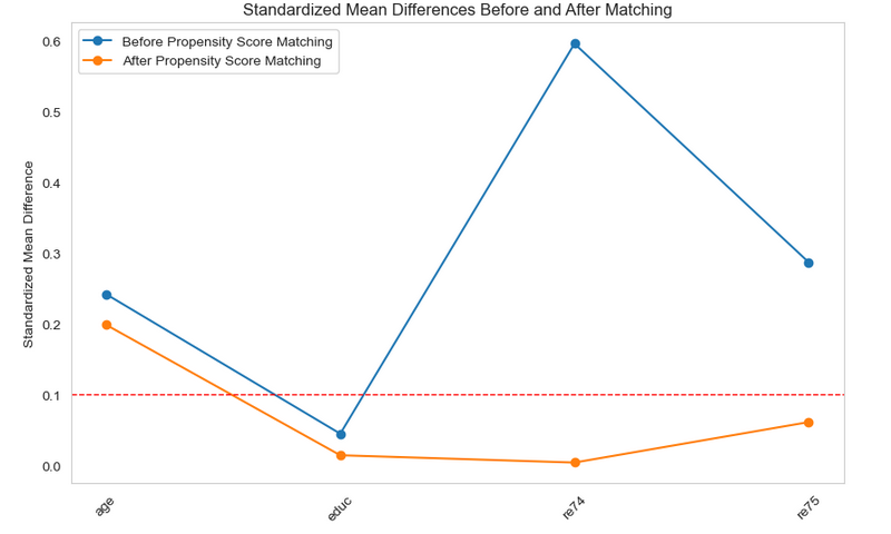
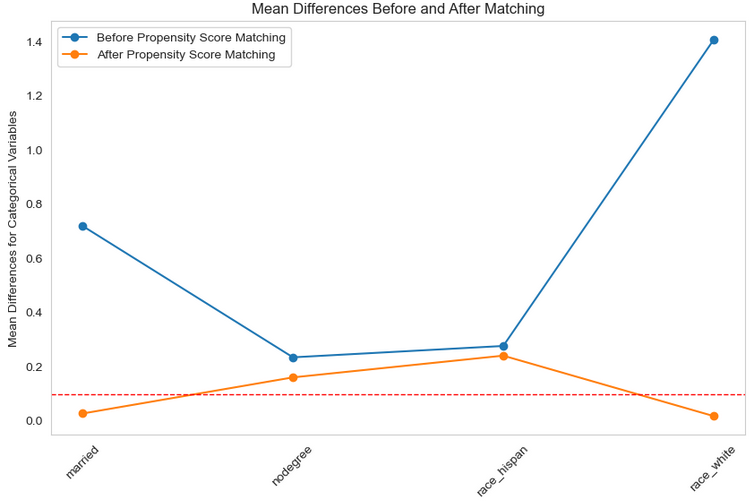
The balance after matching improved significantly compared with the initial lack of similarity between groups. The chart shows that matching notably improved the balance of most covariates. With most hovering around the 0.1 threshold, it’s clear that the control group, after applying propensity score matching, is much more similar to the treatment group.
PSM did not improve the balance of age and years of education. However, both variables were already quite similar before matching. We could have further optimised the results by applying more sophisticated machine learning algorithms. We must remember that we will never achieve perfect balance because of the lack of randomisation. Even randomised experiments can show covariate imbalance due to random chance.
The new balance is practical and shows that we can obtain comparable groups even from observational data. We’re now ready to estimate the treatment effect.
Calculating the Treatment Effect After Matching
Average post-treatment earnings look much more intuitive now, and they finally show the program’s efficiency. After adjusting for differences in confounding variables, we can see that earnings in the group affected by the employment program are much higher. Hence, we can assume that the treated group would have earned 5,300 USD without being affected by the program. The job training program increased the average earnings of affected individuals.
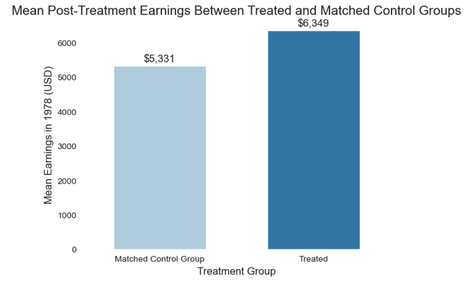
We can also calculate the treatment effect by subtracting the average post-treatment earnings in both groups using the following code:
treated_mean = matched_data[matched_data['treat'] == 1]['re78'].mean()
matched_contol_mean =  matched_data[matched_data['treat'] == 0]['re78'].mean()

treatment_effect = treated_mean - matched_contol_mean

print(treatment_effect)
Comparing the difference in means is only one way to calculate the treatment effect. A better way is to run a regression similar to the one we used above, but this time on the matched data.
Why is this? Firstly, the matching is not 100% perfect. Simply comparing means assumes the covariate balance is perfect. It is much better than before, but a small covariate discrepancy remains. Running the regression model lets us adjust for the remaining imbalance. Controlling for other variables also helps isolate the treatment effect while holding the remaining confounders constant.
Another benefit of regression analysis is more precise parameter estimates. It also gives us confidence intervals and allows us to calculate the estimates’ errors.
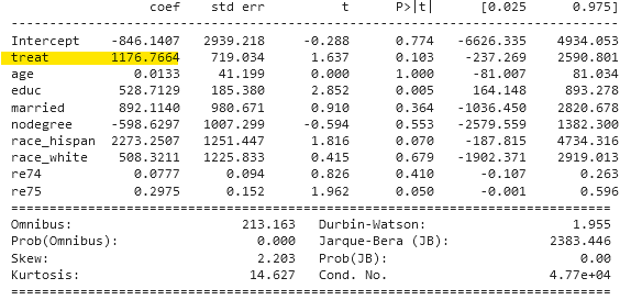
The job training program increased participants’ earnings by 1,176 USD. It has undoubtedly had a significant impact, showing the solid performance of the program – and we are talking about dollars from 1978.
The regression model we ran before the matching returned a treatment effect of 1,548 USD. Propensity score matching decreases the estimated impact of the treatment.
With propensity score matching, we compare only similar units. The matched data exclude individuals that differ substantially from those in the treatment groups. Hence, the treatment effect estimate is more precise because we compare only similar individuals.
Propensity score matching data also reduces covariate imbalance. Unmatched regression might overestimate the treatment effect. With matched data, the groups are more comparable, and bias from imbalance is lower.
For these reasons, propensity score matching yields a better estimate of the treatment effect. Although the effect is smaller, it still shows a positive impact of the job training program, and it is a strong signal to run similar activities in the future.
Limitations of Propensity Score Matching
Before we conclude, we must discuss the limitations and risks associated with propensity score matching.
The crucial limitation of this approach is its dependence on available data. When conducting propensity score matching, we must be cautious, as we are willingly (or unwillingly) assuming we have identified all relevant confounders. We must include all relevant covariates. In the job training case, we believe we included all variables influencing both treatment and the outcome, but we must remain aware of the potential for oversight.
If another variable were entirely unrelated to measured variables and strongly affecting both treatment and outcome, we would have to include it in the analysis. The treatment effect estimation will be biased if such information is unavailable.
In the language of the causal diagrams, similar to the ones from the beginning of the post, we have to include information about all relevant Xs when calculating the propensity score.
Can we test for it? Unfortunately not. This is where domain knowledge, intuition, and the literature come in. Generally, we should obtain as much data as possible (although too much can sometimes be harmful). In commercial settings, it’s often more straightforward when we have access to extensive transactional customer data.
Of course, this does not mean that propensity score matching is useless. We have to use it with care and analyse results from different angles. Analytics work, especially causal inference, blends science and intuition, and testing multiple approaches helps overcome each method’s limitations. It is also a good practice to share a list of assumptions in each study.
Solving the causal problem with different methods (like regression adjustment, PSM, difference-in-differences, synthetic control group, etc.) can also help, as it lets us compare treatment effects across studies. However, not every causal inference method applies to every scenario.
Summary
Propensity score matching (PSM) is a robust solution for estimating causal effects in observational studies. Its ability to balance differences between treatment and (non-random) control groups improves the reliability of our inferences about intervention impact, making it a valuable tool in our research arsenal.
Our case study on the job training program illustrates this method’s practical application and benefits. While PSM has limitations, such as its dependence on observed variables, it remains an essential tool for evaluating activities across settings—from academia and public policy to commercial applications.
References
https://bookdown.org/paul/applied-causal-analysis/att.html
“Causal Effects in Non-Experimental Studies: Reevaluating the Evaluation of Training Programs,” Journal of the American Statistical Association, Vol. 94, No. 448 (December 1999), pp. 1053-1062.
https://cran.r-project.org/web/packages/tableone/vignettes/smd.html
Mostly Harmless Econometrics: An Empiricist’s Companion. Princeton University Press
https://onlinelibrary.wiley.com/doi/full/10.1002/cesm.12047
Rosenbaum, P. R., & Rubin, D. B. (1983). The central role of the propensity score in observational studies for causal effects. Biometrika, 70(1), 41-55.
https://rdrr.io/cran/Matching/man/lalonde.html
https://vincentarelbundock.github.io/Rdatasets/datasets.html