Some of the most important decisions in analytics are made without an A/B test. For example, a marketing campaign can be launched in one country, but we would like to know what its effect would be in other markets. Measuring the effect of new product features is another example. In many cases, we need to ask whether it worked and by how much, but there is no control group to answer this.
In this article, we will focus on one tool for answering causal inference questions: the CausalImpact library. In many causal inference tutorials, this tool is not often mentioned, but it is certainly worth exploring. The library is based on Bayesian methods and can be used to estimate the causal effect of an intervention in time-series settings.
The method is straightforward. It uses the pre-intervention period to learn how the treated series relates to the controls, builds a Bayesian structural time-series model, and then projects that relationship forward through the post-intervention window. The projection is the counterfactual: what would have happened without a treatment or intervention. The gap between what actually happened and that projection is the estimated causal effect.
In the rest of the article, we will explore the CausalImpact library and, with this knowledge, try to help solve the business question at hand.
To make the mechanics more concrete, we will use a simulated example to illustrate the business applications of this approach for a company promoting a mobile app. They launched a new product feature in Germany. The other European markets the company operate in didn’t get this product feature. The question we will try to answer is simple but crucial: what was the real effect of the new product features on app sign-ups?
What CausalImpact Actually Does
Before going to the technical part, it is worth spending a few moments on understanding what the library is doing under the hood. We won’t go into mathematical details, but understanding the general intuition behind the library’s mechanics is needed to apply it correctly in the right scenarios.
The core idea of the library is to apply the Bayesian structural time-series model (BSTS). Structural component means that the model represents the time series as a combination of typical time series components: the trend, the seasonal component, and a regression on a control series. The Bayesian component involves including posterior distributions for all components, which enhances our understanding of the estimates beyond a single point estimate.
Practically, the model asks: given how Germany moved alongside Austria, the Netherlands, Belgium, and Poland for the 180 days before the campaign, what is the distribution of plausible paths Germany would have taken in the 30 days after the campaign had it never been launched?
This distribution is exactly the counterfactual we want. We can also obtain a point estimate by taking the distribution’s mean. There is also the concept of a credible interval, which is the range within which the actual counterfactual value lies with a specified probability, usually 95%. It is just the 2.5 and 97.5 percentiles of the obtained distribution. The interpretation of the credible interval is very interesting, as it highlights one of the most important differences between Bayesian and traditional (frequentist) statistics.
A frequentist confidence interval is a statement about the procedure. If you repeated it many times and constructed a 95% confidence interval each time, roughly 95% of those intervals would contain the true value. A Bayesian credible interval says something different and is easier to interpret. Given the prior, the model structure, and the observed data, the posterior probability is 95% that the true value lies within the interval. That is closer to how everyone actually wants to interpret uncertainty ranges, and it is one of the practical reasons the CausalImpact library is a good tool for causal inference.
The estimated causal effect on any given day is the gap between the observed value and the counterfactual distribution. And because the counterfactual is a distribution rather than a single number, the effect itself has a full posterior distribution too.
One thing worth understanding is the concept of priors, which is fundamental to the Bayesian approach. A prior is the model’s belief about a parameter before it sees the data. Usually, we don’t have to worry about it much, since the model uses weakly informative priors by default. The library does not assume we know the answer before we start. It sets priors broad enough to let the data drive the results in most realistic scenarios.
The Scenario
The next step is to build the data we will feed to the causal model. We will use a simulated scenario to determine whether the model correctly uncovered the causal effect encoded in the data-generating process. It gives us more control and helps us better understand the method. Of course, the simulated environment is easier to work with than real-world data, but it is a great first step for understanding every causal inference approach.
The scenario cannot be too easy, as it would make the overall exercise too simplistic. We will simulate a realistic business scenario including baselines for different markets, seasonal effects, and some noise. The real causal effect of the new product feature introduced in Germany is a 15% increase in registrations. The dataset is created using the following code.
dates = pd.date_range(START, periods=N_PRE + N_POST, freq="D")
t = np.arange(len(dates))

common_trend = np.cumsum(np.random.normal(0.15, 0.6, len(dates))) + 100
common_trend = common_trend / common_trend[:N_PRE].mean()

# Day-of-week effect
dow_effect = np.array([1.00, 0.97, 0.98, 1.02, 1.10, 1.25, 1.20])
dow        = np.array([dow_effect[d.dayofweek] for d in dates])

baselines = {"Germany": 520, "Austria": 180, "Netherlands": 260,
             "Belgium": 150, "Poland": 310}
trend_sensitivity = {"Germany": 1.0, "Austria": 0.7, "Netherlands": 1.1,
                     "Belgium": 0.5, "Poland": 0.9}

noise_sd = {"Germany": 0.05, "Austria": 0.08, "Netherlands": 0.06,
            "Belgium": 0.09, "Poland": 0.07}

panel = pd.DataFrame({"date": dates})
for m in MARKETS:
    trend_component = 1 + trend_sensitivity[m] * (common_trend - 1)

    series = (baselines[m]
              * trend_component
              * dow
              * np.random.normal(1.0, noise_sd[m], len(dates)))
    panel[m] = series.round().astype(int)

post_mask = panel["date"] >= dates[N_PRE]
panel.loc[post_mask, "Germany"] = (
    panel.loc[post_mask, "Germany"] * (1 + TRUE_LIFT)
).round().astype(int)

panel = panel.set_index("date")
In the data generation process, each market’s daily signups are the product of four components: a market-specific baseline that sets the market’s size and a shared trend that moves all markets together. The day-of-week effect is also included to increase weekend signups. On top of that, we included noise to complicate the picture.
A few tweaks were added here to make the model more complex. First, the trend naturally increases in the post-period across all markets, making the causal question less obvious. Also, common trend sensitivity varies by market, making controls still correlate with Germany but not perfectly. Additionally, for Germany, a true lift of 8% is incorporated, which we will try to estimate using the CausalImpact library.
A first look at the data
Before fitting any model, it’s always a good practice to look at the data. It will help us determine whether we can actually use CausalImpact in this scenario. One of the crucial assumptions of this method is that the treated series and controls moved in the same direction before the treatment. If they did not, no amount of Bayesian statistics will save the analysis. We can do it quickly by plotting daily signups across markets.
What stands out is that all the markets moved relatively together before the treatment started. This is very good news, as it allows us to proceed with the analysis and shows that CausalImpact is the correct approach for measuring the causal effect here. We can use the other markets as controls in the model.
If they weren’t trending together like this before the treatment, that would mean no counterfactual reconstructed from those controls would be trustworthy, and we would have to stop here. Notice also that the Netherlands and Poland (higher trend sensitivity) grow more visibly across the pre-period than Belgium (lower sensitivity), which sits flatter. This difference is exactly what we built into the simulation to make the situation more complex.
The chart also immediately points to a clear increase in signups in Germany after the treatment was launched. But looking at the chart alone, we can’t confidently state whether such an effect occurred only in Germany. For example, both Poland and the Netherlands also experienced growth in the number of registrations. Only the model can help us better understand whether the spike in Germany can really be treated as a causal effect or just pure noise.
The Naive Pre/Post Comparison
The first thing most people without training in statistics and causal inference would do with such a dataset is run a simple pre/post analysis. We can take 30 days before the new product launch and 30 days after, and average signups across both periods. The difference between those metrics is used as the first approach to estimate the causal effect. We call this analytics ‘naive’, but there is nothing wrong with checking such data initially. On the contrary, it gives us a good understanding of the overall situation. We only have to remember that such a comparison is often insufficient to determine the final causal effect.
The chart immediately tells us that signups increased the most in Germany. This market saw over an 11% increase in registered users, indicating a positive effect of the newly introduced product feature.
However, Germany is not the only market to experience a significant increase in signups. We also see a significant increase in registrations in Belgium, and we know there was no product change or anything else happening in this country at this time. The things pushing Belgium are seasonality, noise, and upward trends.
The effect for Germany is also higher in this version of the analysis than in reality. We know that the true uplift is 8%, but the pre/post analysis inflates it to 11%. It might not sound like a lot, as the overall effect is still positive, but it limits our understanding of the product implementation’s actual ROI. It can lead to an overly optimistic decision to roll out the product in other markets, especially if its implementation cost is quite high compared to the incremental revenue from the new registration.
This analysis is not useless, as it points us in the right direction of the causal effect. Many analyses would end up at this level. However, it lacks the depth that more sophisticated causal inference tools can provide, which can provide the most stable and reliable causal effect estimate. And that’s why we need proper causal inference training and applications of methods like CausalImpact.
Let’s find out.
Fitting CausalImpact
Everything we did up to this point was the preparation for applying the CausalImpact library in practice. But finally, we can call the model and test this approach. The coding part is very simple, as we can run the entire model in just a few lines of code, as shown below.
#pip install tfcausalimpact
from causalimpact import CausalImpact

data = panel[[“Germany”, “Austria”, “Netherlands”, “Belgium”, “Poland”]].copy()

pre_period  = [str(panel.index[0].date()),     str(panel.index[N_PRE - 1].date())]
post_period = [str(panel.index[N_PRE].date()), str(panel.index[-1].date())]

ci = CausalImpact(data, pre_period, post_period)

print(ci.summary())
print(ci.summary(output=“report”))
First, we prepared the data consisting of the panel from the selected markets. Then, we split it into two datasets: one to indicate the pre-treatment period and another to select the time period after the treatment has been implemented.
One important caveat is that the treatment column should be the first in the data frame. Only then does the library know what region was treated. Apart from this, for the first run of the library, there is nothing else to configure and running the model is just one line of analysis.
The summary() call returns the following output, which summarises the main findings from the causal impact model:
                        Average            Cumulative
Actual                    695.9              20877.0
Prediction (s.d.)         636.6 (11.88)      19097.88 (356.36)
95% CI                    [614.79, 661.35]   [18443.59, 19840.51]

Absolute effect (s.d.)    59.3 (11.88)       1779.12 (356.36)
95% CI                    [34.55, 81.11]     [1036.49, 2433.41]

Relative effect (s.d.)    9.32% (1.87%)      9.32% (1.87%)
95% CI                    [5.43%, 12.74%]    [5.43%, 12.74%]

Posterior tail-area probability p: 0.0
Posterior prob. of a causal effect: 100.0%
The summary looks quite straightforward compared to many other statistical libraries, and it is quite easy to understand and explain. In the first row, we start by checking the ‘Actual’, which is the value the target variable actually had in our treatment group. This means the average daily signups in Germany in the post-treatment period, and the overall cumulative value of this metric in the post-treatment period.
Prediction is where the interesting things begin to happen. This metric shows the counterfactual: what the model believes would have happened without the treatment. It is our best estimate of what German registrations would look like without the introduction of the new product feature. In addition to the prediction, this section provides the standard deviation and a 95% credible interval. We can immediately see that the predicted counterfactual is lower than the actual numbers. This shows that a new product feature had a positive effect on the sign-ups in Germany.
The absolute and relative effect rows quantify the causal effect obtained by the model. The absolute effect is the difference between the actual and the prediction, while the relative effect shows the effect expressed as a percentage of the counterfactual. The output shows that, according to this model, Germany had, on average, 59 more signups per day and 1,779 more cumulatively over the overall post-treatment period. It led to a 9.3% increase in registrations that would not have occurred without the new product feature.
Worth noting is the fact that the model also slightly inflates the percentage uplift. We hardcoded the 8% true effect, and the model shows 9.3%. This difference comes mostly from the considerable amount of noise incorporated in the simulated dataset. And this difference is still considerably lower than that obtained by relying solely on the pre/post analysis.
This, of course, reflects what is often encountered in real life. All the data on human behaviour is messy and complicated, and obtaining a perfect estimate from it is difficult. However, one of the crucial advantages of the model is the presence of the credible intervals, which allow us to quantify uncertainty. It wouldn’t be possible if we stopped at the pre- and post-analysis. When looking at intervals, we get a very useful tool that helps us quantify the worst- and best-case scenarios of the effect. In our case, we can be 95% confident that the actual uplift lies between 5.4% and 12.7%, which includes the true effect. It can be considered relatively wide, but in practice, it allows us to prepare for the worst and best cases and make better decisions about future strategies.
Visualising the effect
Checking the model summary table requires some understanding of statistics to interpret it. Apart from this, it is always useful to plot the results, which makes the output more business-friendly. The library provides default plots via the ci.plot() method, but they may lack visual appeal for professional presentations. For this reason, we have prepared a few charts below, inspired by the default ones but adjusted to look slightly more appealing.
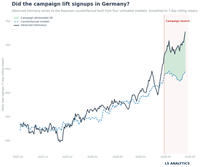
The first chart shows the moving average of the counterfactual compared to the observed data. Before the intervention, those lines are relatively close to each other. They are not the same, but it’s not necessarily a bad sign, as identical lines indicate overfitting, which would prevent the model from generalising well. After the product launched in Germany, we can clearly see that the gap between the counterfactual and actual numbers increased drastically and is purely one-directional, indicating a positive effect of the new product feature on registration numbers.
Another way to visualise the output from the CasalImpact models is to plot the cumulative chart. It shows, only in the post-treatment period, how many additional sign-ups occurred due to the new product. It is only a cumulative daily difference between actual values and a counterfactual, along with the credible intervals. Plotting the effect like this is a useful way to present the effect of a given intervention, along with the uncertainty that naturally occurs with the estimate.
Using this chart can also be a useful way for further financial analysis. If we know the lifetime value of acquired customers, we can use it to estimate the total incremental revenue the new product is likely to generate and calculate its ROI. This kind of analysis will definitely gain a lot of attention in boardrooms and help guide business decisions. This is a great example of how applying causal inference can be connected to business. The final goal of any analysis in a commercial setting is to help make profitable, informed decisions based on the data at hand.
When CausalImpact breaks
Everything we did so far was quite an easy walkthrough of this tool under ideal conditions. The real work is, nevertheless, more complex, and we have to consider where the use of CausalImpact might lead to misleading results. The most difficult part, especially in the era of AI, is not running the analysis, as the code is simple, but understanding the assumptions behind every causal inference method.
No contamination in the control group
The key assumption behind the CausalImpact model is that only the treatment group was treated and that no unit in the control group received treatment. We assume that after the treatment date, only the treated unit received a given intervention. We have to assume that the control group was not contaminated.
When this assumption breaks, the model will still run perfectly well. But in practice, some of this contamination would be absorbed into the counterfactual. If, in our example, Austria also received a marketing push in the post-treatment period, it would make the effect in Germany less noticeable, even though the true causal effect of the product improvement remains the same. Contamination of the control groups makes it way more difficult, if not impossible, to isolate the causal effect.
There is no formal statistical test for this assumption, but a few methods can help. First, it is always good to rely on domain knowledge. Involving project stakeholders and discussing their assumptions can shed light on the method’s validity. Additionally, we plot the control series in the post-period alongside its pre-period trend and look for anything that breaks the pattern. Anything suspicious is worth paying attention to and digging deeper.
A more formal approach is to run the model with each control iteratively removed and check whether the estimate remains stable across versions. If removing Austria changes the effect from 9% to 14%, Austria is doing something suspicious and deserves investigation. Stability across all control subsets is one of the strongest signals of a well-specified analysis.
The pre-period relationship holds through the post-period
CausalImpact learns how Germany relates to the controls over 180 days of pre-period history, then projects that relationship forward for 30 days of the post-period. The implicit assumption is that this relationship is stable over time. It is quite similar to the parallel trend assumption in difference-in-differences. We want the relationship between our target and control to be stable in the absence of the treatment. The assumption says that without the treatment, the target and control should have moved in the same way as before it.
It fails whenever something structurally changes between the pre-period and the post-period in a way that affects the treated unit differently from the controls. For example, regulatory changes in one country, different marketing campaigns, and changes in the product. All this, affecting only a subset of countries, causes this assumption to fail and, in turn, makes the causal estimate less stable or even unreliable.
Testing this assumption is not straightforward, as it is basically untestable. We will never know what would have happened in the world without treatment in the post-treatment period. It makes our life slightly more difficult, but there is nothing unusual in this assumption. It reflects many decision-making processes under certainty, as in the real world. Even randomised experiments do not always yield clear, practical action.
Fortunately, there are ways to help us reduce our uncertainty about this assumption. They won’t give us a definitive answer, as we can only apply them during the pre-treatment period, but they can still help us spot anything worrying.
The simplest possible test is just the visual exploration. It is always worth checking the pre-period fit on the counterfactual chart. In a healthy model, the observed and counterfactual lines should be quite close in the pre-treatment period. They shouldn’t be identical to avoid overfitting the model, but they should still be close enough. We can also plot the raw data to examine trends across all units. It’s useful not only for testing this assumption but also for understanding the data.
A second approach to limit the uncertainty around this assumption is to conduct a placebo test. It works by selecting a fake intervention date within the pre-treatment period. Then, we run the full CausalImpact analysis on that fake date using only the pre-treatment period. If such a model finds a large effect on a date when nothing happened, that’s evidence that the pre-period relationship is unstable and that other factors besides the treatment we are trying to estimate are affecting the behaviour of the units we have. If the placebo test finds such a difference, it’s a clear indication that our model is unstable.
But if it finds nothing, that’s evidence the pre-treatment period is clean. However, we have to remember that it tells us nothing about what happens after the treatment. Placebo tests only confirm that the model behaves well on the data we observe.
What is indispensable in checking this assumption is domain knowledge and careful observation. Did anything unusual happen in Austria, the Netherlands, Belgium, or Poland in April that didn’t happen in Germany? Did any of the control series move in a way that looks structurally different from their pre-period behaviour? Were there events that would have affected Germany differently from the controls even without the campaign? These questions are qualitative, domain-specific, and cannot be answered by running another model. They are answered by knowing the business and being honest about what we don’t know.
Summary
Measuring campaign lift without a randomised experiment is hard, and it is often handled badly. Pre/post comparisons are fast and intuitive, but they attribute everything that changed after the treatment to the intervention. Seasonality, trends, competitor activity, and other factors are mixed with the treatment effect.
CausalImpact is one of the tools that offers another way. By learning how the treated series relates to untreated units before the intervention, it reconstructs what would have happened without the treatment. This allows us to calculate the gap between the actual results and the counterfactual, which can be treated as the treatment effect.
But, as with other causal inference applications, CausalImpact is only as good as the assumptions behind it. All the conditions listed above are important, and it is always worthwhile to think through and assess them properly. Many of them are untestable; that’s why applying causal inference requires not only knowledge of the tools but also an understanding of the problem at hand.
However, when used carefully, causal inference is one of the most valuable tools in the analyst’s arsenal and can help deliver true and tangible business value.