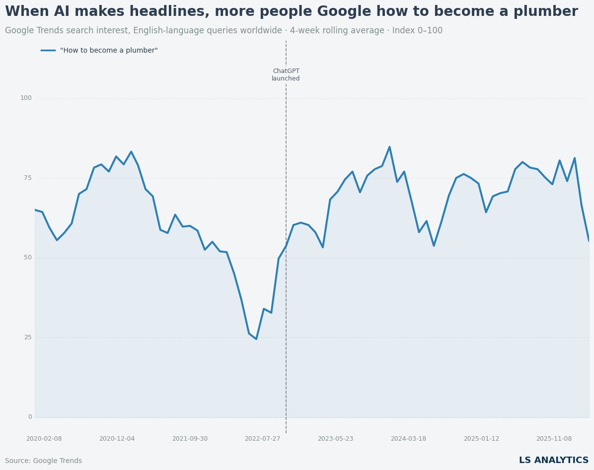
Did AI anxiety push people toward trade careers?
Search interest in “how to become a plumber” jumped after ChatGPT launched in late 2022. And has stayed elevated ever
Search interest in “how to become a plumber” jumped after ChatGPT launched in late 2022. And has stayed elevated ever
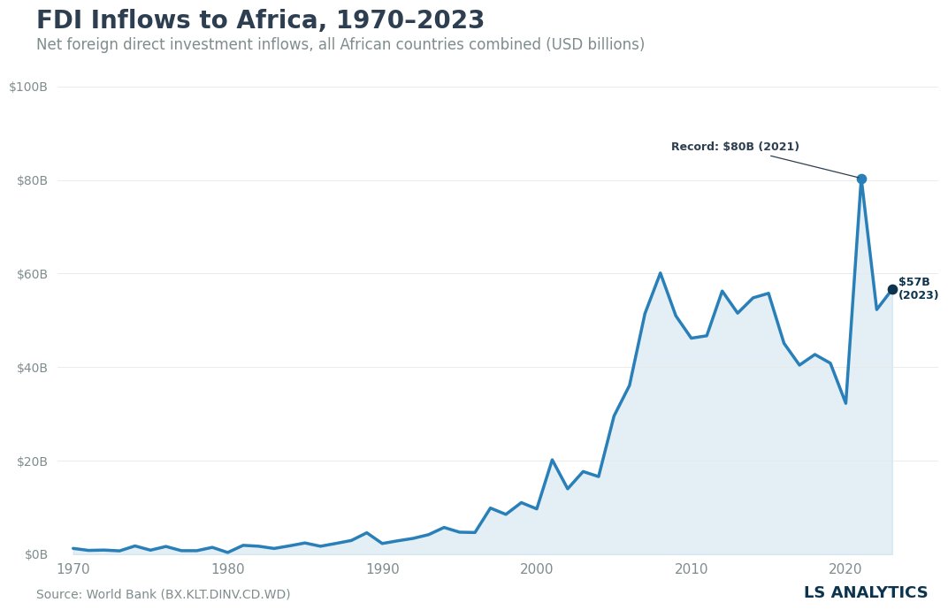
Africa’s FDI inflows have increased every decade since 1970.Near zero then. $57B now. The continent needs this to continue. Investment
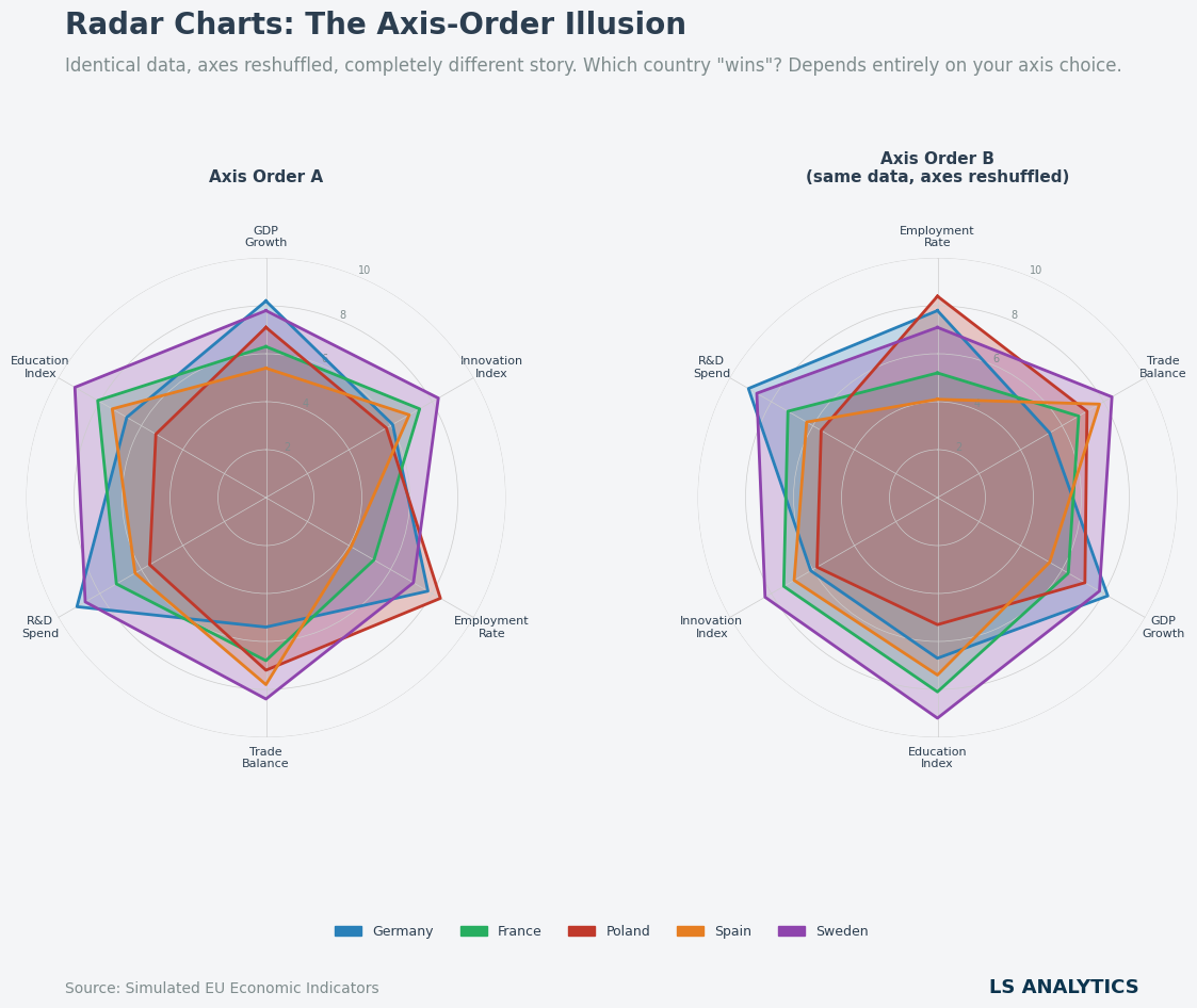
Radar charts are a very popular visualisation tool. Recently, Anthropic released one which went viral and was used to visualise

Every analyst stared at a dashboard showing a seemingly clear pattern many times. Premium customers churn more, marketing campaigns decreased

The most important question in almost any organisation is also the most difficult one: Did something work? You launch a new

Marketing teams often celebrate when dashboards show a clear, positive correlation between sales and advertising activity. Our campaigns are driving
Marketing teams often celebrate when dashboards show a clear, positive correlation between sales and advertising activity. Our campaigns are driving